that this project hadn't taken as long as it did! I had the idea for days but then couldn't decide on a color. Then I had too many flowers, leaves, etc. but couldn't figure out what to keep and what to save for another project. Changed out the inside piece colors, background stamps and sentiment everal times. Went vertical instead of horizontal. For a 3"x4" piece this took way too long to come together - IMHO.
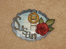
The ivory moire place card frames I found on clearance in the bridal section at Michaels. The inside oval ring? It fit PERFECTLY as is...from an old box of 1700+ shapes by Nicole Crafts I got years ago at A.C. Moore. But I did change it from bright blue to blue-green by adding brown distress ink over it.
All the stamps are Wendy Vecchi's, the Elegant Flourish (used only part of the larger one) and the Tattered Flowers (2 smaller sizes) are Tim Holtz Alterations by Sizzix. The corner frame is Tim's from the Idea-ology line. All inks by Ranger (who else??) The fern punch is Martha's, the shiny buttons all started out clear (flower center, 3 flat leaves). I cut off their shanks and colored them with alcohol inks.
See that larger flower in the lower left corner? If you cut it up like the Tim/Wendy rose you get the middle flower on the bottom. You can stack the left and middle flowers (bottom) and get a really full rose. Unfortunately that one overpowered the piece. I know I have an even number of flowers - a decorating no-no but I think it's okay on this project. Not really noticeable from a design standpoint. All in all it turned out to be a rather decent project IMO.


WOW! This is beautiful!
ReplyDeleteYou're working on your Ranger resume, aren't you? Pretty soon they will feature YOU on a cruise!
ReplyDeleteWow, Susan, I absolutely LOVE this piece! I think the colors are just scrummy, and the use of the flowers and frame are just perfection! LOVE IT!
ReplyDeleteGorgeous Susan, I love the contrast in colours, it's stunning.
ReplyDeletetfs
Alexandra
Beautiful~~~~~love it!
ReplyDelete