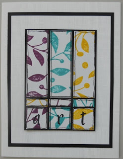
We know Wendy favors a grungy or distressed look and feel to her art but Lori's urging members to think outside their box or comfort zone with this challenge. While I'm not a fan of bright colors I did use brighter
colors in this piece of art that I'm submitting to the challenge she has posed to the EverythingWendyVecchi Yahoo group.
I inked up the background stamp from Rose Art Part 2 in Mustard Seed, Peacock Feathers and Seedless Preserves distress inks and cut the into pieces to fit an ATC. With a Sakura black glaze pen I drew around each piece. The letters 'a', 'r', 't' were stamped in Jet Black archival ink using an old Hero Arts alpha set.
There is a smaller layer of black under the ATC to give a bit of dimension to the card. Another layer of white and black Bazzill cardstocks come between the ATC and the white card (A2) itself.
While this card may not use the brighter colors such as fuschia, lime green, or hot pink, they have taken me outside my normal range of colors. Challenge accepted and met! And NO browns! Gasp!
Subscribe to:
Post Comments (Atom)


Very cool Susan! Love how you branched out yet still kept it in your style.
ReplyDeleteNicely done Susan. It's bright, but not blaringly bright!
ReplyDeleteLove how you used the bright colors Susan! Thanks for joining the MAC, and way to step out of that comfort zone! I knew you could do it!
ReplyDeleteIt's a wonderful atc, Susan!!!!!!!!!!!!
ReplyDeleteGasp, no brown! But anything you touch has that touch of magic and an artist's eye. I really like this!
ReplyDelete