Monday, July 12, 2010

Christmas in July

Today's Compendium of Curiosities challenge is Distress Powder, page 43 from Tim Holtz's book.  I've already seen some of the art others have done and the pieces are wonderful.  If you haven't been able to play along, it's never too late to catch up.  Just having the samples at hand is a nice way to remember to use what you know.

'Christmas Carols' is the image that uses the Distress Powder technique (a combo of Black Soot, Weathered Wood & Walnut Stain).  Around the tag edges I distressed with several browns before scraping the edges for texture.  A bit of black on the very edges and I was content.  The reindeer were stamped in a combo of Sepia & Coffee Archival inks; the music in Black Archival ink.  All the stamps are Tim's.

Love how this tissue tape calendar fits on the fragment; not perfect but close enough.  I ran the Gold Paint Dabber around the edge.  The brown & white ribbon has Fired Brick DI run over it and a touch of GPD.  The Bazzill poinsettia was white but colored with FBDI, Mahogany DI and a touch of Walnut DI with the edges tipped in GPD.  The Bazzill holly leaves have some Peeled Paint DI on them and are also tipped in gold.  A tiny gold brad anchors the two.  The Maya Road chipboard letters have FBDI and PPDI on them.  I ran the FBDI from top to bottom and the PPDI from bottom to top...kind a fade into each other look.  Again, I added GPD to the top and bottom edges. 

It's too hot to contemplate Christmas today but perhaps I can sing (or not!) and get my art spirit to help me along with my next project. 

Hope you have an artistic week!

Sunday, July 11, 2010

Believe and imagine

Sure hope you aren't tired of seeing these altered metal birdcages cuz I have quite a few more to make!  I found them late spring at Michaels for a really good price so I couldn't resist getting more than I needed.

Believe it or not many of the grungeboard and grungepaper elements were naked leftovers from previous projects.  All I had to do was color them.  There's no way I can list the colors used on the individual pieces as I ended up trying out almost every DI color, quite a few pigment ink colors as well as numerous DI embossing powder colors on them.  Some combos I wouldn't have thought about trying but when you're just messing around sometimes it all just works out right.  Crackle paint and a paint dabber or 2 were even used on the grunge elements. 

All the stamps are Wendy's (I think I used 11), lots of TH stuff (die cuts, idea-ology pieces, fragments, jump rings and tissue tape).  The Prima flower (bottom) I've been holding onto for a very long time, wanting to use it on the 'perfect' project.   The fragment with the calendar tissue tape was the last element to be added.  I wasn't sure what the piece needed but when I spotted the new tissue tape roll on the floor I knew I had found it; especially when the month of July was staring me in the face.

I wanted the bird's wing to look more realistic than just adding a bit of grungeboard behind it to elevate it from the body.  I did that but instead of gluing the centered piece of grungeboard behind the wing to the body I glued the blunt end of the wing - more like a hinge but it won't flap. 

Bet my neighbor will be making a real flap when she receives this in 2 weeks for her birthday. Thank you for taking the time to read all the way to the bottom...if you did!

Tuesday, July 6, 2010

Shabby Chic

This week's Compendium of Curiosities challenge hosted by Linda Ledbetter is Shabby Chic.  On grungeboard is stamped the Grunge Alphabet.  I smeared Butterscotch and Terra Cotta paint dabbers.  The tag was colored with Tumbled Glass DI, edged with Walnut Stain DI.   Tim's floral spray with stamped using Broken China DI.  Grungepaper leaves were colored with Lettuce & Clover PI and Brushed Corduroy & Peeled Paint DI before being crumpled.  The nattily attired grungepaper robin is wearing Fired Brick, Brushed Corduroy, and Black Soot DI as well some Terra Cotta paint dabber.  The fragment was edged with the Juniper paint dabber.  All die cuts and stamps are Tim's.  'i', 'r' and 'd' are bubble monograms by Li'l Davis Designs.

I clearly need to use my paint dabbers more often.  Many of them are nearly solid.  Some I can spritz with water and revive them; others are in dire need of a complete reconstitution.  Using pigment inks with the distress inks is fun and often results in some fabulous new colors.

If you aren't participating in the challenge, you should!  You can click on Tim's book cover to take you to Linda's blog for all the details.  Not only is this a great learning experience but the work that has been shared is really cool!  And the prizes have been quite awesome too so a big "Thank you!" to all the sponsors!

Monday, July 5, 2010

Play time

This tag came about because Wanda posted her CCC#3 tag using similar colors.  I couldn't believe how much her sample looked like the one I had lying on my work surface.  I issued myself a challenge to use my piece on another tag.  I'm pretty sure I used Wild Plum, Silver Metallic Alcohol Inks but not sure what other colors.  I used Tim's border dies on each end then stamped one of his foliage images at the bottom using Weathered Wood Distress Ink and Juniper Pigment Ink.  A Sakura black glaze pen made the pen-stitching and Ranger's new white and black enamel accents are on the ends.  The tag was colored using Bundled Sage DI with Cloudy Blue and Juniper Pigment Ink over that.  I stamped one of Tim's flourishes using Wild Plum Pigment Ink then drew around some of the design with Ranger's Inkssentials Pen.  I edged the tag with a black Sharpie for more definition; the ribbon finishes it off.  This is why I don't throw anything away.  You never know when it will be the inspiration for another piece of art.  
Now I'm off for more playtime as I try my hand at CCC #4 - Shabby Chic!  Have fun!

PS - I tried to be artsy-fartsy with my sample being off-kilter but in the photo here it really looks off-kilter.  Oh well.

Sunday, July 4, 2010

Happy 4th of July!

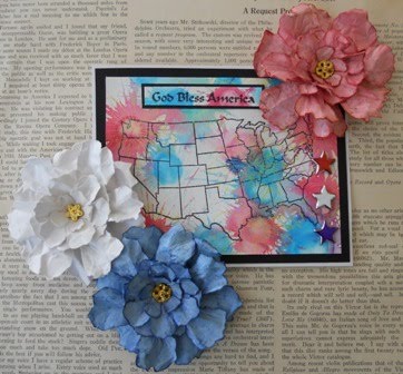
Thought I'd make a simple patriotic card but it looked too plain so I bumped it up by making some red, white and blue posies (Tattered Florals die cuts).  Perhaps they are too large for this display but just think of them as floral fireworks...those are always big!  The technique used on the watercolor paper is called Bingo Blast (from a TechniqueJunkies newsletter).  The stamps are old and I don't remember who makes them (archival ink).  You may not be able to see the gold (Brilliance) fireworks scattered across the U.S.  I didn't care for the silver star brads but Sharpie markers changed them.  The white flower I left white and sprayed it with Perfect Pearl PPs.  The blue was colored with Faded Denim DI, edged with Chipped Sapphire DI, sprayed with Forever Blue PPs.  The red posie has Worn Lipstick DI, edged with Fired Brick DI, then sprayed with Forever Red PPs.

Our community celebrated Independence Day yesterday with festivities around the town square, a parade, and culminated with a splendid fireworks display at one of our city parks.  Check your cameras for a fireworks setting.  On the Nikon Coolpix it worked great!  I got lots of neat photos.

I've now seen Wendy and Tim's new stamp releases.  All of Wendy's are on my 'want' list, not the case with Tim's but I'm sure he'll have new artsy toys that I'll want.  Can't wait to see what he and Wendy have in store for us with add-ons. 

Hope you all have a happy and safe 4th of July!

Friday, July 2, 2010

Go for the gold!

This week has been 'golden' for me.  Sunday I attended my dad's family reunion and saw 2 cousins I hadn't seen in over 40 years.  Twin girls have been born into the family and we have another new family member due to arrive in a few months.  I got a chance to sit down with my good friend, Lori, and chat about all sorts of things.  We've been picking a few tomatoes and fresh herbs and have baby toads and frogs on our deck and enclosed patio.  Unfortunately some of those didn't make it but my daily count goes up and down so obviously there are more than I thought.  The weather has been spectacular...cool in the mornings (50s), not hot (upper 70's-low 80s), low humidity, blue skies, gentle breezes.  After the past week or so it was a welcome relief from the heat, humidity and storms.  I have finally got all the violets out of the yard; now to work on the crabgrass. 

I thought I'd share a bit more gold with you.  You probably don't know it but I am not a jewelry person at all.  Hardly wear my wedding ring (fingers swell too much), never liked how I looked in necklaces of any length, and the earrings I wear are very small.  That being said, this brooch really caught my eye in a recent magazine.  I'm really enjoying making Wendy's roses and flowers using Tim's Tattered Florals and wondered if I could recreate this piece and still do it justice.

With some grungepaper, heavy gold foil, gold paint dabber, archival ink, Tim's die cuts, Wendy's stamps and a few rhinestones - here's my interpretation of the brooch. 

Look around you, you just never know what will inspire you to make art!

Thursday, July 1, 2010

Alcohol Ink Monoprint

Time for another week's Compendium of Curiosities challenge on Linda's blog.  This week we're trying the Alcohol Ink Monoprint.  I chose Juniper, Cloudy Blue, Cool Peri and Silver Mixative alcohol inks.  The stamp is Tim's and I just happen to have these silver numbers that fit right over his image.  I colored the boy's hat and tie with Ranger Adirondack markers (Rust and Meadow).  Added a strip of sheet music that was distressed with Bundled Sage and Milled Lavender.  The same colors were applied to the tag base.  I'm so glad Linda gave us this challenge.  Like so many others I've read the book and thumbed through it numerous times but never sat down and worked through it step by step.  My tag collection is growing slowly but I'm really glad I bought a really large ring for them all!