Thursday, October 3, 2013

I made this for you

Not really, I made it for me!  lol  More playing with distress paints on black cardstock and Studio 490 stencils.  I'm telling you, in real life this really does look like those black velvet paintings.  Or maybe it's just my poor eyesight.  lol You also can't see the depth achieved using the regular and metallic stains on the base tag.  Sigh.

On the black cardstock I used the Brick Wall stencil and various orange and brown distress paints - applied with a small piece of cut & dry foam.  Heat set.  Over this I stenciled the grass (several greens), stems (several greens) and flower (several colors of yellow and orange) from From the Garden.  'Bloom' is from Artful Words and was first colored with a yellow distress paint, heat set, moved the stencil slightly and stenciled again with black distress paint.   I also used Barcodes, Honeycomb, 3 Flourishes (lower corners-distress ink), and Everyday Words. 

I tore the top off the black art and adhered it to the tag (colored with distress stains -metallic and regular- and paints).  Jet Black Archival Ink was used on the top and bottom words and barcode.  Then I stitched around the tag and added a row of zig-zag stitching for something different along the bottom of the black art.

I bet if I had more patience I would do this again but keep applying the colors of the flower, leaves and grass until they were more solid and blocking out the brick wall.  That's if I had more patience!

Studio 490 stencils, Ranger (archival ink; distress ink, stains and paints)

What's in your stencil container?  Hope some of them are by Studio 490!


Tuesday, October 1, 2013

Cheers!

This was a test and I'm pretty pleased with the results.  I wanted to see what the stencil (Studio 490 - Create A Wreath) would look like inked on one side then flipped over and inked again in a slightly lighter color.  The wreath does look thicker but the leaves didn't align like I had hoped.  Oh well.  Still happy.  I used Ranger's distress paints (sorry, I don't remember what colors!) on black cardstock.  The effect reminded me of those paintings done on black velvet.  I also used the 'Everyday Words' Studio 490 stencil for the word.
The black layer is atop a yellow layer on a coral-pink card.  Definitely NOT as pink as the photo above!

Monday, September 16, 2013

Bye, bye birdie!

No, not that bye, bye birdie!  I don't even sing in the shower so get that thought right out of your head.  This is a bird I created for the Frilly & Funkie challenge 'Anything Goes' that ends 9/17.  I'd been waiting for my new Studio 490 stencils to arrive and they did, just in the nick of time.  I also wanted to follow along with Wendy's tutorial she shared on Sept. 5 featuring painted pastes and parts.

I started pulling out the ingredients and deciding what stamp sets and art parts to use when I spotted the idea page on the 'From Nature' art parts package.  Love it!  So my tag is a combo of Wendy's tut tag and the art parts package photo.

I also knew I wanted to incorporate some of the findings that The Funkie Junkie sends along with your order.  The leaves and twine were in with the Studio 490 stencils.  Gorgeous bits to play with!

Ingredients:  #8 tag; Studio 490 ('From Nature' art parts, translucent embossing paste, Dots & Stripes Border Stencil, stamps from 'Sunshine & Art', 'Art From The Heart', 'Art Colors Life', 'All About Art', 'Art Gone Postal'; new archival inks of Potting Soil, Cornflower Blue, Watering Can, Orange Blossom); Ranger distress paints (Weathered Wood, Vintage Photo, Wild Honey, Peeled Paint, Fired Brick), Black Enamel Accents, Sepia and Jet Black Archival Inks, Walnut Stain Distress Ink; Claudine Hellmuth's Multi-Medium); Idea-ology black plastic sticky-backed letters

Tip:  Use enough embossing paste to stand up to your stamp.  I didn't and you can barely see the plaid background I chose.  Also, don't completely cover the tag.  I covered the tag more than I thought.  

I splotched Weathered Wood Distress Paint over the letters before applying them.  Love that look and how they stand out but don't take over.  How did that flower get stamped where the bird's eye should be?  Fortuitous!

So what are you waiting for?  Pull out a few stamps, stencils, embossing pastes, archival inks, and distress paints and get busy making art!

Sunday, September 15, 2013

Did you do it?

If you didn't, who did?  lol

Someone needed a bit of a lift and they're a huge fan of pumpkins so I thought this might just do the trick.  The pumpkin and facial expressions are from G-Rated Rubberstamps.  There are several expressions in the set, I used 2.  The images were stamped in Jet Black Archival Ink onto watercolor paper and colored with distress inks (yellows, oranges, browns, and greens) and a waterbrush.   Around the edge I drew a line with a water-soluble graphite pencil and wiped over the line with a damp fingertip.

The conversation bubble was drawn onto another piece of scrap card stock and edged with an orange distress pad.  I hand wrote the message.  There's an orange layer (Sizzix Texture Stack) and a black card stock layer before all was adhered to a white card (approx. 3.5"x6.5") and will fit in a No. 6 3/4 envelope.

Perhaps I gave you a lift today...I hope so!

Saturday, September 14, 2013

Falling for embossing paste

Lame, lame, lame.  Oh well.  There you have it. 

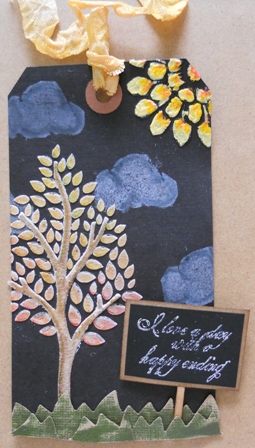
The September challenge on the EverythingWendyVecchi Yahoo group is to use embossing paste.  Now that Wendy has out white, translucent, black, gold and silver there's not much you can't do to colorize them even further.  You can add or cover with paint, re-inkers, Perfect Pearls, glitter, and archival inks.  I opted to use white and translucent on my #8 black tag.

I used Wendy's new Layered Tree stencil and white embossing paste for the leaves, let air dry, then did the trunk and branches, again letting it air dry.  I used distress inks and markers to color them.  The leaves start out yellow at the top and gradually go to red at the bottom but it doesn't show up very well in the photo.  Sorry because IRL it really is lovely.  I did texturize the paste by tapping my knife lightly on the paste before it dried.  Note: In hindsight I should have done the trunk and branches first so the leaves would pop out instead of the trunk.  Such is life.

The 2 Fancy Flowers stencil was strategically placed in the upper right hand corner for the sun.  Who'da thunk?  I used translucent paste so I could smudge Claudine Hellmuth's Yellow Pastel, Dab of Yellow and Modern Red on the 'rays' to mimic the heat of the sun.

From a piece of cut 'n dry foam I created a cloud and stamped it 4 times using Snow Cap Pigment Ink.  Once dry I  used the Broken China Distress Marker to outline it and make the clouds look puffier, more rounded.

I stamped the sentiment (*I love a day with a happy ending) from Sentimental Art in Snow Cap Pigment Ink on black card stock then framed with brown card stock that had a distress brown ink smudged around the edges.  Glued that to a flat pick and instant yard sign.

Using an o-l-d Sizzix die I cut grass from scraps of kraft core'dination and sanded them and curled them so I could add them in layers to the front of the tag.  A snippet of ribbon to the top and I'm outa here!

*This sentiment is perfect for this week.  We had 2 days with happy endings.  Monday I learned I will have my cataracts removed and special lenses implanted so that I may not have to wear glasses any more except possibly to read.  After 50 years I am more than ready!  Wednesday we learned that my husband's lung cancer is in remission!!!! 

Wednesday, September 11, 2013

Die-namite dies

A few weeks ago I was a lucky winner of a $10 gift certificate to Die-namite Dies.  I chose several and they've arrived.  Oh my gosh...the details in these are just awesome!  And then I saw on Lynne Forsythe's blog that there was a challenge using a sketch and a dare (ribbon).  I thought, why not?  And so I did.  A random winner will be chosen to win a $25 gift certificate at Die-namite DiesI still have some dies on my wish list...hint hint! 

Die-namite dies:  Leafy Branch, Knobby Branch, Leafy Flourish (thank you, Lynne, for encouraging me to see the forest beyond the trees and tell me to cut these dies apart for more versatility!)

I started out with a piece of corrugated cardboard and slapped some Liquitex Ceramic Stucco on it.  Once dry I smeared Claudine Hellmuth studio paints until I was happy with the result.  I cut a piece of burlap to fit on the board and glued it down with Multi Medium. 

The patterned card stock is from My Mind's Eye (Mischievous) and the blue cardstock is from a core-dinations pack.  It was run through Tim's Halloween background embossing folder, sanded and smudged with brown inks.  The edges were tattered with the distress tool.

From more core-dinations kraft core I die cut the pumpkin and tattered leaves (Tim's movers & shapers).  I cut the mini bottle (new movers & shapers die) from cardboard and smeared Antique Linen Distress Crackle Paint over it.  Let it dry then smudged brown inks into the cracks.  I created a faux label by blocking the area off and smearing more brown ink off the edges.  On the label is a small skull & crossbones remnant rub.  The pumpkin has a bit of raffia tied around the stem and a small leaf added from the leafy branch die.  The bottle also has a bit of raffia tied around the neck.  It's supposed to look as if the branch is holding the bottle.

The leaves and branches were sanded and scrunched for dimension. 

Idea-ology time piece, game spinner, long fastener and ornate corners finish off the piece.  I did treat the corners to black soot distress paint, a bit of sanding and Caramel alcohol ink.  You'll see Tim's on-the-edge die (Iron Gate) cut from black kraft core-dinations and used at the top.  A few strands of burlap and a ribbon were added to the upper right hand corner.

The finished piece is about 7" x 8" and has an easel on the back.

I wonder what other dies can I cut apart for more versatility??????

Sunday, September 8, 2013

I'm a visionary

No, if that was the case I'd probably know what was going to happen at my doctor's appointment tomorrow afternoon.  I'll be finding out if the time is right to have my cataracts removed.  My vision is getting blurrier, even during the day.  Night time driving is out of the question.  I'm scared that if I have to wait my husband's health may take a turn and I won't be able to help him.  I'm his sole caregiver and need to be on top of my game at all times.

So I guess with all my anxieties about the outcome of the appointment, it's only fitting that I chose to feature eye related items on my version of Tim Holtz' September tag this year.

Supplies:  TH stencils (006, 008, 009, 010, 011); Studio 490 white embossing paste; Distress Stains (Wild Honey, Picked Raspberry, Broken China, Peacock Feathers, Tarnished Brass); Distress Ink (Picked Raspberry, Walnut Stain, Black Soot); Distress Paint (Picket Fence); Jet Black Archival Ink;  Stamp set (Oddities CMS 083); unknown alphabet

I decided to use the same color palette as Tim's because it was out of my comfort zone.  I had to create my own chit chat stickers out of kraft card stock.  The optical lens dangling from the ribbon was a find at a local antique store as was the eye glass lens over the eye.


I was still in the mood to try these same techniques so I picked out my preferred color palette of fall (yellows, oranges, reds, touch of gray-green, and brown).

Supplies:  TH stencils (001, 007, 008, 010, 012, 013); TH stamps (Calendar 2, Mini Halloween 2); Distress Stains (Mustard Seed, Spiced Marmalade, Barn Door, Peeled Paint, Tarnished Brass); Distress Paint (Picket Fence); Distress Inks (Peeled paint, Black Soot, Tea Dye, Walnut Stain); Studio 490 white embossing paste; Martha Stewart witch punch; EK Success thumb punches (cat, bat); Idea-ology (skull & crossbones)


What do you see when you play with stains like this?  Do you choose your color palette first and see what stamps call to you?  Do you choose your stamps and then your color palette?  Or do you just randomly grab and see what happens?  No matter which way you choose, have fun and let it just happen!