I've now taken 2 ATC classes from Bobbi at The Scrapbooking Studio in Bloomington, IL. In January the ATCs were inspired by Tim Holtz and featured many of his Sizzix dies and embossing folders and Idea-ology. Of course you can't forget about the Ranger inks and kraft core'dinations cardstock, kraft glassine paper or tissue tape. Yum! Several techniques were used on the bases - lots of learning going on!
Last Saturday the class of 12 included my good friend, Lori (also list owner of the EWV Yahoo group). Isn't always more fun to make art with friends? This class used Wendy Vecchi's Studio 490 stamps and art parts, and a stamp or two from Tim Holtz. Some of the ATC bases were cut from the kraft Fun Day collection that belongs to My Minds Eye. Ranger inks, grungepaper and more kraft core'dinations, and some Idea-ology were used to embellish the ATCs.
Bobbi is the manager of the Bloomington store (there's another location in Moline, IL) and is full of great ideas! I'll be taking another class with her on Saturday - making a vintage bracelet. I saw it in the 'idea' stage and couldn't wait to sign up.
Thank you, Bobbi, for letting me post the pictures of your ideas for some awesome ATCs!
Not only did I leave the store with the ATCs did my part to stimulate the economy with my purchase of new Studio 490 stamps, My Minds Eye cardstock and a Ranger archival ink pad.
Note of discovery: See the spool on the 3rd ATC (Wendy collection-first row, far right)? I think it looks extra vintage-y and grungy. The spool is 2 layers of chipboard. I let the glue ooze out and left it there to dry. When you ink over it the color is resisted but stained a bit. It looks as if the paper is torn or sanded but it's not. I've used it lots of times and it never ceases to amaze me how it ages something so easily.
Showing posts with label My Mind's Eye. Show all posts
Thursday, March 22, 2012
Wednesday, September 1, 2010
Sew Many Layers
The challenge this week on the Simon Says Stamp & Show 
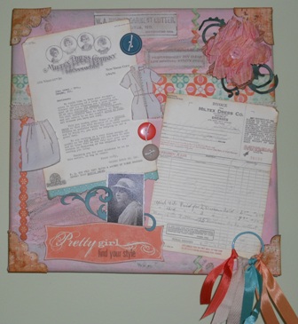
blog is all about showing your layers. I don't know how many layers are on my 12"x12" canvas. The project started out with 2 colors of paint dabbers on the base then added a bit of green and brown distress inks. The edges were touched with a brown archival ink pad. There are also 2 colors of distress crackle paints smeared randomly on the canvas. The scrapbook papers (My Mind's Eye-So Sophie 'Pretty Girl') are a layer, the letters another and the embellishments yet another...at least as far as I'm concerned.
The 1931 letters were scanned and reduced to 5"x7" and are from a NYC dressmaker to a local central IL clothing shop. When I purchased the letters, the lady in the antique store was very familiar with the local store and shared a few interesting tidbits. I love knowing the history behind stuff like this.
Wendy's stamps are used exclusively (Fashion Style & Art and Art by the Number). The clothing was stamped on muslin with archival ink. The labels were stamped on muslin and twill tape. The 4 corner pieces were stamped on the backside of the cardstock. After I cut them out I distressed them with Brushed Corduroy DI then applied Glossy Accents. Once dry, Coffee archival ink was rubbed all over them for more distressing.
Tim's Tattered Florals die met up with Twisted Paper ribbon for the posy with an antique button for the flower center. The layers were touched by several distress ink pads.
The leaf flourish was cut with a Sizzix die on Bazzill cardstock. The flourish around the photo is grungeboard and has several pigment inks and distress inks used on it.
A bit of lace (also touched by distress ink), buttons and a ring with coordinating ribbon remnants complete the layered look. Once again I've gone with a color combo outside my box (red-orange, pink and blue-green) but I fell in love with the paper anyway. Color-wise it will clash in my sewing room. Oh well.
Subscribe to:
Posts (Atom)