Sunday, June 23, 2013

Happy anniversary, Walt!

I made Walt's card a la Studio 490 and Ranger.  I have a rotten sinus headache with all the accoutrements so I apologize for not getting the details about what stamps, colors and techniques I used.  Sorry!!!!  The card is a half-page size...much larger than I normally do but he's worth it!  lol

 
I made the oversized envelope but didn't want to just seal it with tape so I made a special sticker for the flap.  This stamp is always good for a chuckle!


Sunday, June 16, 2013

Happy Father's Day

My step-dad and mom are on a cruise and today is a sea day for them.  I thought using this Travel Ways set from Tim Holtz was quite appropriate for the day.


I used a speckled blue card stock as my base then a layer of denim card stock before stamping on the aqua card stock.  The 2 lighter images were stamped using Ranger's Watermark Ink while the ship and sentiment were stamped in Ranger's Jet Black Archival Ink. 

The waves were cut from the denim card stock using an old Sizzix yellow die.  I reversed the direction of the waves for the front and back layers.  I smudged darker distress blue ink on the crests then piped white puffy paint on top.  Before it dried I added Judikins Aegean Silver embossing powder.  Heat set to indicate foam on the wave crests.

A corner rounder punch was used on the tops of the two layers.

Happy Father's Day, Ken!

Saturday, June 15, 2013

June is busting out all over

The month is half over - how did that happen?????  I was waiting for inspiration to use Tim's technique for his June tag.  It finally happened...here's the result.

This is the first time I've been pleased with the outcome of using the distress markers on watercolor paper.  I discovered that I needed a lighter touch of the marker to the paper.  I'ved used them plenty of times just to use as regular watercolors by scribbling on my craft sheet.  They always turn out good that way...at least for me.

#8 tag, Stampers Anonymous pear stamp (M3-638), watercolor paper, distress inks, distress markers, archival ink, grungeboard, sticky-back canvas, Sizzix die, stamps from Warehouse District and Mixed Media

Friday, June 14, 2013

Feelin' blue

Over on the EverythingWendyVecchi Yahoo group we've switched the challenge schedule to monthly for the summer.  Everyone is busy with travel plans, summer activities, etc.

The June theme is to use the color blue, some metal, and of course, at least one Studio 490 stamp on your art.  I've used 6 stamps, plenty of Ranger coloring mediums and some Ten Seconds Studio metal, plus faux metal (sheet metal tape) on the label.

Reworded:  I stamped the phone on the front side of the periwinkle metal sheet and then took a roller ball tool over the lines I wanted to indent.  I then turned the phone over and put pressure on the spots between those lines so the opposite parts would be poofy*.  A bit of thread wound around a paint brush is the telephone cord.

The bottle was stamped in Manganese Blue Archival Ink on recycled plastic from a Sizzix die. I added some silver punched circles for the pills then pounced the white distress paint over the bottle and silver distress paint over the cap.  The number was stamped on the front of the bottle using Jet Black Archival Ink.

The Sizzix arrow was cut from grungeboard covered with Sticky Back canvas and watercolored with blue distress ink.

The tag was colored with lots of distress inks and stains; heat set; covered with clear crackle paint; then brown and black distress inks were smushed into the cracks.  Black Enamel Accents were painted along the edge of the tag.

I used stamps from Label It Art, Art Inspiration, Call It Art and She Spoke of Art.

* Betcha didn't know a phone could be poofy, didja?  lol 


Tuesday, June 4, 2013

Roses, roses, roses...everything's coming up roses!

Don't know why, maybe the rain, maybe the cooler temperatures but this spring has been stupendous for roses here in our community.  The bushes are just dripping with buds and blooms.  And when the red ones in my neighbor's backyard peek their faces through the white picket fence...ah, it's just heavenly!  Please ignore the mess in their backyard...they're still planting their containers and are a bit disorganized.


So when a local scrapbook store announced a jar or bottle decorating contest I couldn't help but think of the bottle I made last year with red roses adorning the front.  Well, I just got a call announcing that I'd won 1st place and that a $50 store gift certificate was waiting for me!!!!!!!!!!!!!  And you know those new Susan Tierney Cockburn flower dies by Sizzix?  They'll be the first things in my shopping basket!  Thank you to the judges for selecting my artwork!


Monday, June 3, 2013

Happy anniversary!

Back in April, Wendy Vecchi shared a card she'd made using her stencils and stamps.  I loved it so much it was the inspiration for these anniversary cards.

Stencils:  Never Enough Hearts, Diamonds Are A Girl's Best Friend

Stamps:  Art From The Heart, My Kind of Art
Stencils:  Never Enough Hearts, Dots & Stripes Borders

Stamps:  Art From The Heart, Art For You
Stencil:  Never Enough Hearts; Stamps:  Art From The Heart, Wildflower Art, My Kind of Art
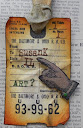
Stencils:  Never Enough Hearts, Dots & Stripes Borders; Stamps:  Wild Flower Art, Art Parts, Art Gone Postal

This card is an 8.5x11 sheet of dark blue card stock folded in half.  It's large but that's okay...it's for my hubby!  *vbg*


Ranger distress inks, distress markers, distress paints, archival ink were used on all 4 cards.

Saturday, June 1, 2013

Tweet


How about a nice and simple stamped card that uses Ranger distress inks and Stamp Camp stamps (Make A Tree and Hanging Stuff)?  I haven't pulled these out in a l-o-n-g time and thought it was high time they met an ink pad again.

As luck would have it, my base card and the ribbon just happened to coordinate with my stamped image.  Serendipity!  Victorian Velvet distress paint covered the white bridal flowers perfectly and also worked with my color scheme.  The flower center is a yellow dot out of Claudine Hellmuth's pastel yellow paint.

I don't remember who makes the corner punch that I used on the white layer, sorry.