Wednesday, February 27, 2013

Mini train case to be transformed

We have an Ulta store that sells all things related to beauty..hair, face, etc., even a salon.  In the clearance section I found this mini train case full of make up.  It retailed for $24.99 but was reduced to $9.99.  It's 7" square/tall when closed and extends to 17" when open.  Doesn't it look like it could be used similarly to Tim Holtz's Trinket Case?  It comes in this red or an off-white with a darker brown-ish/gray color in the grooved portions.  Guess it's supposed to resemble alligator skin or something.  Red is one of my favorite colors so I may not be transforming this except to remove the make up trays and use it for more suitable purposes, like embellishments.  LOL  It seems quite sturdy and able to hold a fair amount of weight.  I can't wait to put it to the test.


Tuesday, February 26, 2013

Tag Shadow Box

Recently Karen Cheetham taught a class at Absolutely Everything featuring her Chunky Tag Shadow Boxes.  Sure wish I could have been there...they looked smashing!  And you're not limited to a tag, either, as she's used Tim's large pumpkin and gingerbread man.  I did see photos of a wintry box, Halloween, and stacked flower pots as well as butterflies and another with a chocolate bunny for Easter.  I'm thinking that Tim's large rabbit die would be super cute with a hole in his tummy showing carrots or jelly beans.

Karen has just shared her instructions with the AllThingsTim Yahoo group so I just couldn't wait to try this myself.  After making a mock up I decided to make my tag shadow box without using the foam strips but created a box to fit behind the front tag.  I cut a 2nd tag with the same opening so it fits around the shadow box giving it a completely finished look from the back.  I also used Tim's small easel die to create a stand for displaying it on a shelf.

Several ideas are forming in my head for the other seasons...and sounds like our weather forecast will give me plenty of time to work on them.

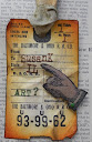
Here are some of the items I used to create my version.

Martha Stewart:  ribbon, mini hydrangea, rabbit, fern leaf, butterfly punches

Tim Holtz:  Lost & Found stamp set (birds), rabbit die, Tattered Banners die, Auturmn Gatherings die, Tag & Bookplate die, small easel die and the cobblestone die (made my own stencil)

Ranger:  distress inks, Rock Candy Distress Stickles, Jet Black Archival Ink

Claudine Hellmuth:  acrylic paint

core'dinations:  kraft core and color core

Studio 490: embossing paste

Miscellaneous:  moss, oval hand punch, square toothpick


Quite a few people (my good friend, Candy, included) have been using Wendy's brick wall stencil as partial fades and I love that look.  This got me to thinking about it's use here but it really was too big for this piece as the sides and bottom are only 1/2" wide/deep.  I bought the cobblestone die not realizing how many little cobbles there were and that they don't stay put without help.  Argh.  So I wondered if I could turn it into a stencil.  The strip dies don't really cut anything beyond lightweight paper but I had a backing sheet from labels and cut it....like buttah!  Because the one side is a non-stick surface this was just perfect for a stencil.

If you have any questions, please ask.

Once my neighbor sees this I have a feeling I'll be making another one very soon.  lol


Sunday, February 24, 2013

Take 3 and call me in the morning

I needed some health-related cards...general hospitalization and the other for a broken bone requiring surgery.  Rubber Baby Buggy Bumpers produced some really great images; sure hate they're no longer around.  These docs are perfect for so many situations, aren't they?

The doctors and capsules are Rubber Baby Buggy Bumpers while the sentiment and label are Studio 490's She Spoke Of Art.  Ranger archival inks in Jet Black and Crimson were used exclusively.  The capsules have Glossy Accents on them for added dimension.  I only had a Sizzix dog bone but I think it gets the job done.


Guess I'll head back to my messy space and see what speaks to me.

Friday, February 22, 2013

Fabric journal cover

Since my husband's cancer diagnosis, I have kept a journal of all his medical appointments.  I note his vitals, comments from the doctor, weather, funny stories, personal feelings, etc.  The journal is rather loud in color and lacking in appeal.  I had been thinking about altering it but wasn't sure if I wanted to use a medical theme or something more pleasant...like flowers, etc.

To the rescue comes the most recent challenge (#4) on the EverythingWendyVecchi Yahoo group - incorporate fabric into our art piece.  Being a huge fan of denim I sewed a cover (remember covering books with brown paper bags and doodling all over them?) then stamped some images from 8 Studio 490 sets using Fabrico black fabric ink.  I used Ranger Adirondack Acrylics (now called Adirondack Dimensional Pearls) to paint  the images.  The leaves were stamped in a light paint, colored in to be solid, then overstamped with a darker green paint.  Once all the images were dry I went over the black lines with a Micron pen so the images would show up better on the darkness of the denim. The flowers with the rounded petals lost the words that are part of the image so I just painted them solid.  All images have at least 3 colors of ink on them for depth.

Here's a pic of the entire journal cover.

And here's how it looks when the journal is closed.


Studio 490 stamp sets:  Rose Art Part 2, Let Your Art Have Wings, Dreams Of Art, Be Inspired...Make Art, She Created Art, It's More Flower Art, Speaking Of Art

Wednesday, February 20, 2013

Card making frenzy

About half way through the month I look to see what birthday and anniversary cards I need to make for the following month.  This gives me time to make sure I can come up with ideas, purchase any supplies, and get them in the mail before the individual's special day.  I also make 12 cards that I call COM (Card of the Month) that I send out to a select group of family and friends.  These I do assembly line style.  Sometimes my birthday and anniversary cards are made the same way, especially if I like my idea and it can be done for males, females and juveniles.  I might change up the color scheme or embellishments along the way.

Here are the cards I created for March.  I used all Ranger inks and Stickles, Studio 490 stamps, Tim Holtz stamps and dies, Provocraft embossing folders, Bazzill cardstock, and Martha Stewart ribbons. 


Now I will focus on some sympathy and encouragement cards.  I find I'm needing them more and more these days and want to have some on hand so I'm not in a mad rush to get one made and mailed in a timely manner.

Thursday, February 14, 2013

Happy Valentine's Day!

Here's a card I sent out to a few people.
Exterior
Interior
'Love' was stamped in red archival ink using an old Memory Makers foam stamp set (Jersey UC font).  The inside features Tim's mini globe, ticket and mini heart.  The sentiment was created with a Dymo Caption Maker (the pink one with 3 font wheels included). 

The globe was cut from green and blue paper and put back together using the appropriate global colors.  I colored the stand's metal pieces using silver and gold paint dabbers.

Here's a paint brush project that I'll give my sweetie later today along with the 2 cards I made him (shared in earlier posts).

The paintbrush was painted with Claudine Hellmuth's Traditional Tan paint, sanded then distressed with brown archival inks.

The mini lock and key were cut from grunge board and I used Tim's Rusted Grunge technique on them  (Compendium Book 1, Page 45).  The mini cupid was cut from heavy chipboard and run through one of Tim's embossing folders.  Cupid was painted with the black paint dabber before adding gold paint onto the raised areas.  He's holding 2 mini red kraft core'dinations hearts that were sanded and edged in brown distress ink.

Maya Road chipboard flourishes were layered behind the crinoline flower (mini poinsettia and tattered florals and leaves dies that were colored with distress stains and edged with gold paint).  The flourishes were also painted black and highlighted with gold. 

'Love' was spray-painted black through an older Sizzix embossing brass stencil (removed from the plastic folder).

Generic ribbons were distressed and placed at the top and around the metal band on the paint brush.

Just another way to let my sweetie know he swept me off my feet 30 years ago!

Wednesday, February 13, 2013

Time

Tim Holtz has posted his February tag for the 12 Tags of 2013.  I don't like to follow too closely in his footsteps but prefer to use the techniques he's shared or perhaps some of the embellishments or color palette.  This month I chose only to use the same techniques and basic layout.

Stampers Anonymous stamp sets:  Mini Blueprints 4, Pen & Pencil; Ranger:  distress stains, distress inks, archival inks, distress markers; tissue tape, pocket watch embossing folder (TH-Sizzix); #8 tag, watercolor paper; Technique Tuesday stamps: Borderline: Live For Today; kraft core core'dinations; string; clock face

I wonder what he has in store for March?

Sunday, February 10, 2013

Thank you!

To all those who sent me birthday wishes, I
so much!


Ingredients:  Bazzill cardstock base, unknown satin ribbon, scraps of TH paper I was given, overstamped 'Thank you' using Tim's new Simple Sayings in Dusty Concord, Martha Stewart punched flowers and leaves, Stickles

Friday, February 8, 2013

Happy birthday!

They say it's my birthday!  Yep, they're right!  So I made myself a card...nah, this one is for my aunt who turns 90 in a few weeks.  I saw the inspiration card in a recent Papercrafts magazine.

I used whitewashed core'dinations paper but embossed (Provocraft - Number Collage) the solid side.  Sigh.  So I drew around the numbers with a white Sharpie.  The candles were cut from corrugated cardboard, painted white, then inked up with distress ink.  The flames were smeared with some yellow glimmer spray.  Tim's new stamp set, Simple Sayings, (love this!!!) provided the label and phrase. A bit of crinkle ribbon was dropped into some Spun Sugar distress stain and tied into a bow.  Ta da!


***I've created a blog that will describe our journey as we battle Walt's lung cancer.  Please feel free to join us over there.  We can't thank everyone enough for their support.


Thursday, February 7, 2013

I only have EYES for you

So, what 4-letter word can I use on my project for the 3rd MakingArt challenge on the EverythingWendyVecchi Yahoo group?  And NO disrepectful, crass, etc. words.  Boy, that certainly narrows it down, doesn't it????  lol  Like I would do that and share it in a public forum.  Maybe one day...

I figured that words such as 'wish', 'love', 'home', 'star' would be easy and can already be found within Studio 490 stamps, art parts, stencils, etc.  But I want something different.  So I started flipping through my sets.  Aha!  This set is perfect...An Eye For Art.

My journal page features the word 'eyes'.  I will tell you that you really must, must double check your placement of stamps.  See, I often put my stamp side up so I can visualize the page.  Sometimes that doesn't affect placement, but with these eyes it does.  That's why the left one has a lighter spot in the middle.  Not once, but twice I stamped the wrong one...in embossing ink!  Sheesh.  No amount of brushing off embossing powder and drying the ink would make this spot disappear.

I sprayed the whole page with several Fireworks! sprays by Tsukineko.  They have glimmery stuff in each bottle which I didn't realize.  Oh well.  The sprayers don't seem to have much control so I went with whatever landed on the page.  A saturated water brush and towel were used to lift the color from the eyes.

Using one of Wendy's new stencils I smushed distress ink into the leaves, continually moving it around the page, flipping it over as necessary, in several colors.  Several distress markers gave the leaves and stems definition.

The eyes were colored using Sakura Glaze Pens...just playing with them in the same color palette as the page.  Continuing along that theme I used another new stencil and smushed more ink into the hearts then outlined them with a water-soluble graphite pencil.  Over the top I used yet another new stencil (loving all of them, Ms. Wendy!!!!!!!!!!) and applied her black embossing paste.  So crisp and clear...just perfect for this page!

The purple words were cut using Tim's Alphabetical decorative strip die.  I outlined them in black and white (shadow and shine) then went over the top with Glossy Accents.  I dropped them on the page - accidentally - but liked the placement so well I left them there.  The circular eye at the top was just what was needed to finish the page.  I did place tiny black dots around the page...just messin' about.

I think I'll share this with my husband on the 14th...along with the other love-ish things I've created.