Wednesday, January 30, 2013

Techniques calendar

This is the 2nd year I've followed Ink Stained Roni and her techniques calendar.  She is always trying something new and is eager to share her learning experiences with her readers.  I followed some of her calendar pages quite closely, others not so much.  Roni's pages were done on banners but I chose to use Tim's Cabinet Card Sizzix die.  I did not write down the products nor colors I used but I'm sure you'll be able to figure many of them out.  Each of the calendar pages has its own post on her blog so you'll be able read all the details individually.  Maybe you'll have time to explore her blog and try some of these techniques for yourself.  Enjoy!
Alcohol Ink Felt Stamping
Faux Speckled Graniteware Enamel
Rubber Band Crazy String
Faux Bleaching
Sliding Stencils
Cling Wrap Wrinkles
Blasted Stickles
Baked Acrylics
Transfer Foil Paper
Tissue Paper Redo
Double Stamped Watercolor Images
Groovy Inks 


Sunday, January 27, 2013

Aster Wreath...what if

you didn't use Versacolor pigment inks for this Rubber Stamp Tapestry set but used distress inks instead?  And what would a monochromatic look be like?  See for yourself. 

 Lapislazuli - Chipped Sapphire

 Lilac - Picked Raspberry
Split Pea - Crushed Olive
Green Tea - Mowed Lawn
Metallic Gold - Scattered Straw
Bamboo - Bundled Sage

 Lapislazuli - Aged Mahogany

 Lilac - Fired Brick
Split Pea -Festive Berries
Green Tea - Barn Door
Metallic Gold - Worn Lipstick
Bamboo - Tattered Rose

 Lapislazuli - Walnut Stain

 Lilac - Vintage Photo
Split Pea - Tea Dye
Green Tea - Gathered Twigs
Metallic Gold - Old Paper
Bamboo - Antique Linen
Looks like it may be time to re-ink my brown distress pads.


I don't keep to my circles and ovals very well but I was more concerned with trying different color schemes.   It was great fun to have time just to play with this set because I don't use it, or any of my Rubber Stamp Tapestry sets, often enough.  I think it's time they see more ink!

Friday, January 25, 2013

Not your typical Valentine

Here's another card I'm submitting to the EverythingWendyVecchi Yahoo group's latest challenge which features using the Pop 'N Cuts system, a heart, some glitter, and at least one Studio 490 stamp.  If you don't have the Pop 'N Cuts system you can use anything dimensional on the inside.  I found a product I'd forgotten about...Popeze PopBlocks...in one of my drawers.  They will let me add dimension without the die cut.  These are clear acrylic strips that are sticky on one side and when shaped are like a block.  You could easily make your own from coordinating card stock.  They have 2 other products that are similar; you should check them out if you'd like to add a pop out to your card's interior.

For the outside of the base card I added brown distress ink around the edge of the card.  On the layer I smeared brown and peacock feathers distress ink all over then pressed the foam pad down to leave rectangles of color.  Water droplets were thrown about and heat set.  Over this I placed some mesh drywall tape and smeared more of these inks through it...instant stencil!  Then I pulled out another tool....long forgotten...Stampers Anonymous stencils.  Under 'Accessories' choose 'Masks & Stencils' then scroll down until you come to these brown paper stencils.  They are impervious to anything I've put through them...inks (waterbased and archival), stencil paste, etc.  I smeared brown distress ink through 2 of them and Studio 490 silver embossing paste through the middle one.  Heat to dry, cover with diluted Stream Paint Dabber and edge with a brown distress marker.  Smear with your finger to highlight and age.  Cool, huh?  Four small brown snaps were placed in the corners (more forgotten items used!).

Now for the inside where the PopBlock is used.  I stamped the boy (Studio 490 -Art For Men) in Jet Black Archival and colored him with distress markers.  Cut him out then chopped off his legs (sorry little fella!) to make him fit.  Behind him is the PopBlock.  In his hand he's holding a heart (Studio 490 - Art From The Heart) balloon out of Adirondack kraft core core'dinations cardstock.

Below the young man is Tim's Harlequin border cut from more Adirondack kraft core core'dinations.  I sanded it while all in one piece (put some tissue tape on the back to hold it together).  I drew around the center diamonds with Aqua Stickles.  Once dry I wrote 'Happy Valentine's Day' using the Black Soot distress marker then misted it so the ink would run.

I love using dark turquoise and browns together, especially for a masculine card!


Monday, January 21, 2013

So in love

Admittedly I'm finding working on themes of love and Valentines a bit tough these days.  The anniversary of our first date falls right before Valentine's Day so I have a number of 'love' occasions that call for a card...or 2. 

Over on the EverythingWendyVecchi Yahoo group we're into the 2nd MakingArt challenge.  Lori has stepped away from Wendy's books this time and has asked the participants to incorporate the following items into their art: Pop 'N Cuts, a heart, glitter, and of course, at least one Studio 490 stamp.  No Pop 'N Cuts?  No problem!  Use a dimensional piece for the interior of the card.  Hey, we're not that strict around here!  lol

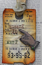
 I used numerous blue and orange distress inks on top layer of my card front then overstamped with the background text (Art From The Heart) in Jet Black Archival Ink.  In the lower left hand corner I smeared some of Wendy's embossing paste and immediately stamped in to it, misting the stamp first, and washing it right away afterwards.  Once dry, I added more orange inks to the top so you can see what was stamped (also from AFTH).

The heart (AFTH) was stamped into a glue pad then on my cardstock and quickly covered with Art Institute Glitter...a gorgeous bright fall orange.  Reminder to self:  don't use this glue again as it's not very durable.  Sigh.  An Sizzix mini arrow (TH) was cut from coordinating patterned cardstock and layered behind the heart.  A Martha Stewart silk ribbon bow finishes the heart.


I've layered several coordinating cardstock strips (cut with Sizzix dies and a Martha Stewart border punch) at the top, top middle, and lower parts of the card.

More coordinating cardstock was used to cut a 2nd medallion for the pop part.  A grungeboard heart and a Maya Road key complete the medallion.  The mini portrait dies were cut from kraft core core'dinations and sanded.  More cardstock and grungeboard hearts complete the card.  Behind the medallion the portraits and heart are on wire that kind of bobble when the card is opened.

This card certainly isn't your typical Valentine palette but I think I like it even better.

If you don't have the Pop 'N Cuts system I hope you'll look into getting it.  There are so many options for this and it makes cardmaking so easy and quick.  The hardest part for me is knowing when to stop adding elements!  lol

Sunday, January 20, 2013

Crackle embossing paste

I recently picked up a jar of Dreamweaver's Crackle Embossing Paste.  Yesterday I finally found the time to try it out.  The instructions say to layer it over the flat black embossing paste.  Was that really necessary or could I use gesso or acrylic paint?  How would it affect the size of the cracks?


I found I didn't have to use the black embossing paste but it did seem to make larger cracks.  Using the CEP over white gesso gave me very small cracks and they appeared to be non-existent until I applied color.  Over the black gesso gave me the same very small cracks but you could see the black coming through.

The flower used Studio 490's white embossing paste (made by Dreamweaver's).  Once dry I put the stencil back in place.  Over that I placed some drywall mesh tape and colored over it using distress markers.  It kind of gives it a cross-stitched appearance.  This technique can be found on the Dreamweaver's site I believe.  I learned about it in a Dreamweaver's class a number of years ago.

The large heart and flower stencils are from Studio 490 while I created my own stencil using Tim Holtz's  Sizzix mini dies of the cameo people.

So Studio 490 is now offering gold and silver embossing pastes along with the white and black.  I hope to schedule another play day just for them real soon.

Medical update on my husband...he does have Stage 3B lung cancer.  The plan is to start chemo and radiation about Feb. 4Along the way will be plenty of tests and office visits to see if the treatment plan needs to be altered.  Again, I thank you for your support...I can't imagine walking this path by myself.

Friday, January 11, 2013

2013...off and running

I got another chance to get into my art room and played along with Tim Holtz as he creates his January tag for the 12 Tags of 2013

Supplies:  Retro Circles embossing folder, Vial Labels, Film Strip Ribbon, silk ribbon, stamps from 'Good Thoughts', 'Calendar 1', and 'The Journey', mini Sizzix dies (butterflies, cog), game spinners, grungepaper, bulldog clip and LOTS of Ranger inks


*********************************
Medical update: We saw the oncologist today.  The last biopsy showed more signs of lung cancer so my husband is no longer a candidate for surgery.  We will learn next Thursday and Friday what chemo and radiation protocols will be followed and when.  Fortunately this can be done locally and we won't have to travel 3-4 hours each way for surgery and follow-up treatments.  Thank you all for your thoughts, concerns and prayers.  The journey has just begun but we are in high spirits and have had it confirmed that yes, my dh does indeed have a heart, a brain and courage.  So where is he hiding those blasted red shoes????  And those flying monkeys better not be around here...anywhere!  Not nohow!

Wednesday, January 9, 2013

Red gingham Studio 490 style

It was a bit fiddly but I made a red gingham border for a journal page.  And because I used several Studio 490 stamps and stencils, this journal page will be entered in the first challenge of the year for the EverythingWendyVecchi Yahoo group. 
First I placed the heart stencil on my page and taped it down with washi tape.  Using a blending tool I smudged red ink from the outside in, leaving the center lighter.  I stamped the large weedy spray in distress ink with the stencil still in place.  Around the edge of the heart I traced the outline using a water-soluble graphite pencil and smudged the line to soften the look.  The text inside the heart was stamped in Jet Black Archival Ink.

After the outer part of the stencil was removed I taped the heart itself over the image so I could work around it.  The honeycomb was inked with Black Soot distress ink and rolled around the page...in hit or miss fashion. 

I took the Dots & Stripes Borders stencil and rubbed more red distress ink over it then turned the stencil a quarter of a turn to create the look of gingham.  I placed the dot stencil down the centers and smushed Black Soot Distress Ink through a single row of dots.

With the Classic Words stencil I applied Wendy's new black embossing paste through 'always' and heat set it.  I moved the stencil and inked 'remember' in red distress ink.  I heat set the ink then repositioned the stencil so I could smear more black embossing paste and use the red version as a shadow.

The page seemed a bit empty so I recreated the heart, taping the heart in place then moving the outline stencil so the 2nd heart would appear to be in back of the first one.  I followed the steps as above.  Of course, you just can't use the honeycomb without the bee!  It was stamped on white Clearly For Art and cut out.  The wings were spritzed with Pearl Perfect Pearls Mist (only visible in person and at a certain angle - sorry!).

Studio 490 stamp sets:  Original Art (LCS091, Art For You LCS093
Studio 490 stencils:  Classic Words, Large Heart, Dots & Stripes Borders

So I leave you with the text...Always remember...great art often begins as creative chaos.  Yep, that about sums it up!


Tuesday, January 1, 2013

Happy..New Year/Birthday!

Happy birthday to 2013!  And I want to wish Tim Holtz a happy birthday on the 7th!  The final Compendium of Curiosities v. 2 challenge hosted by Linda of Studio L3 is to create a birthday card for Tim using any technique from either book 1 or 2.  I wasn't going to participate as we're heading for St. Louis, MO for another medical procedure with regards to my husband's health situation.  I'll be without a computer for a few days but the mind was churning out ideas so I decided to go for it.  Knowing that some lucky winner will win an autographed embroidered canvas apron and extra goodies didn't hurt.  *smiles*

Front


Interior


I used several techniques on the front panel that was created from Ranger's Specialty Paper and Tim's Retro Grunge Paper Stash.  First up I scribbled all over the front of the SP with Antique Linen Distress Stain, heat set (really looked cool...rather like marble) then added some Squeezed Lemonade DS.  Heat set again, then spritzed water into my hand and threw it onto the SP.  Heat set.  Then I picked up more of the droplets that were left on my craft sheet.  More distress inks were rubbed along the edges (browns and greens).  What do you think of the green marbling effect on top?  That was created by inking up the tall evergreen from Studio 490 (3 Cheers For Art) in Peeled Paint DI then rolled across the SP in places.  The sentiment, also from the same Studio 490 set, was stamped in Jet Black Archival Ink.  Immediately poured clear embossing powder over the entire piece and heat embossed.  Very tactile to the fingers as well as the eyes.  I created corners from paper scraps and stapled them (Tim's mini fastener) to the top layer.

The inside layer was cut using one of the Pop 'N Cuts trays.  The edges were cut using Tim's Plaque and Postage on-the-edge die.  The edges were distressed with green and brown distress inks.  I cut another smaller label (still part of the PNC) and stamped a Studio 490 birthday greeting (Card Art Essentials), using Jet Black AI, in the center.  Around the edge of the smaller label and the banner bits I squeezed on Black Enamel Accents.  Both the banners and smaller label are pop dotted.

An older Sizzix die was used for the 3 candles cut from scraps of core'dination cardstock.  After they were sanded, I distressed them with Walnut Stain DI.  The flames were colored with Mustard Seed DI as well as matching Distress Stickles.  They were pop dotted and layered behind the pop up.

Tim's calender and hand (Calendar 1 and Steampunk) were cut from more core'dinations scraps.  After sanding, the edges were distressed.  The hand was colored with Distress Markers.  Both are pop-dotted; the finger is pointing to the 7th.  '41' was cut using Tim's Wordplay die and more core'dinations scraps.  Sanded and distressed the edges, more pop dots on the back.

This was a fun card to create and a nice way to end the CCCv2 challenge.  I hope Tim enjoys all his birthday wishes from his fans and has a super spectacular day.