Tuesday, November 30, 2010
Wendy's latest flower creation
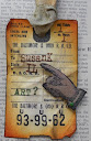
Wendy created a really cool piece of art using Art Parts and Clearly for Art on her blog the 29th. I followed the directions for the flower - what fun and very cool! I created a tag...am stingy with my Art Parts! LOL
 First I clear embossed the watercolor paper tag (cut with Tim's new die!) with Wendy's text background stamp. Butterscotch and Denim pigment inks were smeared all over, as well as some brown distress ink. I salvaged some of Tim's tissue tape from an earlier colorwash spritz project - the color was perfect for this tag. I made my flower just like Wendy's but I think mine is a bit darker. I chose some of her larger leaves, stamped on grungepaper with olive archival ink, then added the black archival dots with another of her stamps. Wendy's sentiment is at the top but I chose a game tile for the 'L'. Naturally, it was distressed with sandpaper and inks and a Sepia Copic marker. A piece of natural colored twine was knotted at the top - it just needed something there. Felt ribbon and rickrack and a green brad (also distressed with sandpaper) help tie in the color combo.
Sunday, November 28, 2010
Distress inks (and more) galore

The background technique was one Tim used in 2007 on one of his first Christmas tags. I made some faux printer blocks, added holiday tissue tape, sticker from the seasonal stash, stamps, grungeboard tree die, a rusty snowman and a bulldog clip (neither are Tim's).
Let's see...Distress Ink colors include Weathered Wood, Black Soot, Barn Door, Fired Brick, Aged Mahogany, Tea Dye, Frayed Burlap, Walnut Stain, Crushed Olive, Shabby Shutters, Bundled Sage, Peeled Paint, and Pine Needles.
I always use more than one shade of a color when distressing. Not only does it add more color interest but the shading has more depth. Try color combos that you haven't before...add a bit of dark blue to the edges instead of dark brown or black. You'd be amazed at how neat it looks!
I do need to find a way to keep the ink color from bleeding because it makes snow no longer white. Maybe heat setting the ink would help or finding another product to create the snowy effect. At least it's green and not yellow!
Tuesday, November 23, 2010
Bingo!
 I'm currently playing several games of on-line Bingo so this seemed an appropriate embossing folder to use for the CCC this week. Double Distress is the name of the game and I used the technique on the Bingo card as well as the snowman. The snowman actually got distressed 3 times because he's sporting some Distress Stickles on his snowflakes. Everything is Tim and Ranger with the exception of the Maya Road Bingo piece (sanded off the black and used green distress ink on it) and the snowman's flakes (they're Provocraft).
 Sunday, November 21, 2010
Gesundheit!
I've been wanting to make a different sort of project for quite some time, something simple yet could easily be decorated for another theme, and could become a gift. Hmmmm...aha! This is it! I found it while wandering around the Splitcoaststampers site. I did tweak a few things and will make further changes now that I've constructed one as a test.
The tissue box cover (I used a generic brand so dimensions must be checked before you start cutting!) uses black and kraft cardstock, a Snowflakes Cuttlebug folder, Spellbinders snowflake die, grungeboard letters and grungeboard, brown and black Distress Inks, Tim's scallop border die, mitten buttons and some gold brads that were painted black with a Sharpie marker. A bit of Distress Stickles for some added glitz and I have a gift worth giving!
 Thanks, Tim & Mario, for sharing how to make the faux printer's letters (s-n-o-w)!
 I already have plans to make several more for my sisters and mom for the holidays. I'll be using lots of Wendy's and stamps Tim's dies for them. The covers need to be much brighter; my family wouldn't go for this dark stuff. Sigh.


Blogger, I give up. Why, oh why, can't you put multiple small images on one line?????? Grrrr.....
Wednesday, November 17, 2010
Don't it make your brown eyes blue?
 After seeing the various stamps and color combos used for the 22nd week of the CCC, I opted to use the vision images from Tim's Oddities set. I chose several brown alcohol inks and one blue one, with copper as an accent.
 Ta da!
The Alcohol Ink Splatter technique makes me think of Rorschach tests.
Monday, November 15, 2010
I'm happy...a Santa puzzle
I don't usually make two-fers but this week it worked out that the challenges went hand-in-hand. First, Hels' Sunday challenge was to feature Santa Claus. Over on the Simon Says Stamp & Show blog the theme was to create a piece that made us happy and tell why it made us happy.
I'm happiest when making art for someone who appreciates my work and never expects to get any of my work but is always thrilled when they do. Loving shabby/chic/rusty stuff helps! LOL This sums up my neighbor, Becky, so this one's for you! She also loves puzzles so I couldn't resist working up this small gift for her.
The cinnamon Altoid tin (dark red) was coated with Claudine Hellmuth's gesso then several coats of blue and brown paint and brown distress inks to coordinate with the colors in the Santa ATC I found in Tim's seasonal stash of papers. The puzzle is the 1/4 size sheet of the same image, adhered to lightweight cardboard then run through the Sizzix puzzle maker die.
Once the image was adhered to the tin, I covered it with USArtQuest Perfect Paper Adhesive (matte finish). After that dried, I smeared Rock Candy Distress Crackle Paint over the top, then wiped brown distress inks over the cracks for a more vintage look. I added a small snowflake at the top and the faux postage stamp at the bottom is from Tin Can Mail and stamped in black archival ink.
The final color is really a dark slate blue with brown edges. I carefully took the hinged lid off to facilitate the painting. I know Becky is going to love this...sure wish I didn't have to wait for Christmas to give it to her!
I'm happiest when making art for someone who appreciates my work and never expects to get any of my work but is always thrilled when they do. Loving shabby/chic/rusty stuff helps! LOL This sums up my neighbor, Becky, so this one's for you! She also loves puzzles so I couldn't resist working up this small gift for her.
 |
| Altoid tin - front |
 |
| Santa puzzle |
 |
| Altoid tin - back |
Once the image was adhered to the tin, I covered it with USArtQuest Perfect Paper Adhesive (matte finish). After that dried, I smeared Rock Candy Distress Crackle Paint over the top, then wiped brown distress inks over the cracks for a more vintage look. I added a small snowflake at the top and the faux postage stamp at the bottom is from Tin Can Mail and stamped in black archival ink.
The final color is really a dark slate blue with brown edges. I carefully took the hinged lid off to facilitate the painting. I know Becky is going to love this...sure wish I didn't have to wait for Christmas to give it to her!
Wednesday, November 10, 2010
A (Tim)e for introspection
How can you choose just one? That's what the Simon Says Stamp & Show design team is asking us to do with Tim Holtz's stamp line in this week's challenge. I use several of his stamps quite a bit but that doesn't necessarily mean they are my favorite. One that always makes me stop and think is 'It's not who you are that holds you back...'. When contemplating my mojo (bet you thought I'd say navel, didn't you???) on any project I often think about what I want the piece to say, how it reflects on me, myself as an artist, and what the world percieves of my work. Yeah, extra deep thinking this morning...don't know where it's coming from.
 Anyway, I chose this message for my tag. I started out by stamping the sheet of paper from School Desk with watermark resist ink. It's subtle, but there. The lighting washed all the purples on the tag into more gray tones. But I truly did use Milled Lavender, Stormy Sky and Dusty Concord before hitting it with mists of water. The sentiment was stamped with black archival ink.
A scrap of musical* tissue tape lies across the bottom of the tag. It was treated to a color bath of alcohol inks (Stonewashed, Pink Sherbet and Raspberry) along with blending solution to remove some of the color.
*I tend to listen to classical music while in my art room; I don't want any lyrics to impact my work but lto et the music flow through me and let what happens happen.
Enjoy the journey was stamped with Duo Embellishing Adhesive by USArtQuest and multi-colored metallic flakes were pressed onto the tacky adhesive. I stamped my name (Inkadinkado) in black archival, creating shadows with Ranger's Inkssential White Gel Pen. The black dots came out of the Black Enamel Accents bottle.
I am enjoying my artistic journey. I've grown, changed direction numerous times, and broadened my horizons with more mediums and products. It's not about aquiring the goods, it's using them. Thank you for helping me along the way. Your comments make it all worth while.
Monday, November 8, 2010
Time flies - where did October go????
I believe I saw a countdown calendar this morning that says only 16 more days until we feast...didn't want to know how many more days for the other holidays. Does time seem to fly faster as we get older or are we just busier?
 It's Monday and that means a new challenge using Tim Holtz' book 'Compendium of Curiosities'. This week we're working on our Perfect Distress technique, found on page 38.
For my background I chose to ink up a Cuttlebug embossing folder (Clockworks) and stamp it on the tag before applying various brown dye inks all over to age it. A copper marker was run around the edges. Next, the technique. Did you know Forest Moss Distress Ink and Mandarin (new color!) Perfect Pearls make copper? See for yourself. The clock tower is from the Pen and Pencil set.
Using Tim's Carnivale alpha strip I cut out the letters to spell time in paper to compliment the colors in the tag. When gluing them I offset the top layer to give a shadowed effect then edged the left side and bottom with a copper marker.
I punched out an oval, distressed it with brown inks, edged it in copper then stamped 'flies' using an old Hero Arts alphabet. The wing was cut from Tim's Heart Wings die, distressed with ink, crumpled, then edged in copper.
The clock face is a copper 3-D sticker, the spinner is Tim's. Well, not his personally, but from his Idea-ology collection.
Sunday, November 7, 2010
More Wendy classes!
Yesterday I got to take 2 more classes with Wendy Vecchi! In each class we got to use some of her new Art Parts. We took a break at noon so we could eat and shop before Wendy's demo on Clearly for Art. She also talked about some of the newer Ranger products. It was fun being with old and new friends at Scrapbook Friend'z in Bloomington, IL.

 In the second class we created an Art Parts holiday spool. Again, more of Tim's seasonal stickers, grunge paper, and Wendy's background stamps. There are some Maya Road embellishments, too. Another fun piece that got us all inky!

The first class was called 'Oh So Merry' and featured the 3.5"x5" art parts frame. Grunge paper and stickers from Tim Holtz' Seasonal stash were featured, along with your choice of Wendy's background stamps. The hanging bauble was attached using a charm clip (gotta get some of those!). Lots of elevation in this piece - so much fun to create!
 In the second class we created an Art Parts holiday spool. Again, more of Tim's seasonal stickers, grunge paper, and Wendy's background stamps. There are some Maya Road embellishments, too. Another fun piece that got us all inky!
 I did discover that when inserting the spool stem into the flat pieces it was easier to do it when I wasn't fighting the natural direction of the paper. It's kind of like any other cardboard tube, if you twist one way it will uncurl or open, if you twist the other way the tube will go in nice and easy.
What with the cooler temperatures and these Christmas creations, I'm in the mood to start my holiday cards.
Happy holidays!
Thursday, November 4, 2010
Love is in the air
My grandmother is probably rolling over in her grave right now as she thought shabby was something that should have been replaced, wasn't clean, looked worn out, etc. Oh well, she'll just have to spin because I happen to like the look. I'm not a stark white, ironed sort of person. (Giggle)
Of course I forgot to take a picture of the frame before I altered it. I found it in the clearance section of Michaels. There was crackle paint on it, the key I took off and the sentiment at the bottom said 'Love is patient, love is kind'.
All that aside, here's what I did to make my shabby picture frame that houses my grandparents' wedding day portrait. The photo is on very shiny paper so it was hard to get a good picture, even without the glass.

I painted over the entire frame with Claudine Hellmuth's Traditional Tan paint then added another layer of color with Antique Linen Crackle Paint. Weathered Wood and Black Soot distress inks were rubbed into the cracks. I love Wendy's new background stamp of German text (Botanical Art) as both my grandparents came from strong German families. This was perfect stamped in Sepia archival over much of the frame.
The main sentiment is Wendy's from Love to Make Art; first lightly stamped in Coffee Archival then overstamped with Black Archival ink, giving it a slight shadow. The month and date stamps were stamped in Black Archival but I don't remember the manufacturer.
Using Tim's Tattered Florals and rose leaf from Tattered Leaves, I punched out quite a few sets from cream cardstock. Some flower layers were overstamped in Sepia Archival with the German text background. I lightly inked the flower layers with brown distress inks and Bundled Sage distress ink to the leaves. I spritzed them all, scrunched with my hand, then let air dry. I spritzed again with Biscotti and Pearl Perfect Pearls and water using the Ranger mini mister. Again, scrunched and let dry. I found some white satin roses that were the perfect fit so they got swiped across a brown distress ink pad and hit with a spray of water.
I smeared the Pebble Paint Dabber on the key to antique it. I added 3 rows of vintage lace - mimics grandma's dress. We still have her dress and displayed it at their 70th wedding anniversary party. It's made of very thin fabric; virtually see-through so she must have worn an industrial strength slip underneath! As my grandparents are no longer with us I hope they're able look down and be pleased with my work.
Wednesday, November 3, 2010
Merry Christmas!
Okay, so I'm a bit early. But the morning temps here sure felt that way...especially with all the frost on the ground making it look like it had snowed!
 Over on the Compendium challenge site Linda selected 'Industrial Grunge' from the book. The technique description and photos can be seen on page 54. Just yesterday I picked up Tim's Vintage Shabby paper stack, never dreaming I'd be using it so soon...if at all. The colors aren't really me but when I saw the blue papers I thought of steel blue, ice, silver and thought it would make a cool backdrop for Tim's Carved Ornament that also found it's way into my shopping basket yesterday.
 Over on the Compendium challenge site Linda selected 'Industrial Grunge' from the book. The technique description and photos can be seen on page 54. Just yesterday I picked up Tim's Vintage Shabby paper stack, never dreaming I'd be using it so soon...if at all. The colors aren't really me but when I saw the blue papers I thought of steel blue, ice, silver and thought it would make a cool backdrop for Tim's Carved Ornament that also found it's way into my shopping basket yesterday.
I did add a bit of brown distress ink to the edges of the paper before adhering it to the tag. Some steel blue velvet ribbon and Silver Liquid Pearls make this all work. The silver paint dabber was drawn along the edges of the tag to complement the silver ornament hangers. Tim's 'Merry Christmas' was stamped and heat embossed with detail silver powder. I did some shadowing around the letters with a blue marker so the text would stand out. A Stardust Glaze pen was used on some of the flourishes on the background paper but that doesn't show up in the photo. It adds a subtle sparkle to the tag in the right light.
But I'm not ready for winter...yet!
Subscribe to:
Posts (Atom)